★ open to ux/cx/product/research roles · brooklyn, remote, or relocating
~/supritha/work · index
★ a portfolio of ships, not slides
Things I've made that have actually shipped.
Three projects across a school in Bangalore, Lightburn in Massachusetts, and Tinkerblox. Different muscles, one designer. Click in — they scroll sideways once you're inside.
01
SVS School
26 years without a website. One weekend online.
2025solo · live
02
Lightburn
One message, five surfaces, one voice.
2024cx by design
03
HALO × TinkerBloX
An Edge AI IoT marketplace mockup — designed and built in one day.
Problem26-year-old school invisible online, losing admissions to competitor imposters with the same name.
What I didSolo end-to-end — research, personas, design system, build and ship in exactly 30 days.
The twistUsed Claude as build collaborator, briefing AI with designer-level precision to execute typographic and motion decisions.
ResultPage 1 Google ranking for their own name. 20% of new applicants found them online. 8 enquiries in 4 weeks from zero.
⚡ short on time? try Highlights in the sidebar — key moments only.
26
years without a website
1
month from brief to live
20%
of new applicants found them online
8
enquiries in 4 weeks
★ before i start
This case study documents an end-to-end website design for SVS — a 26-year-old State school with zero digital presence. I was the only designer, and this went live.
A quick note on how this was built.
One unusual production note, up front: I built this site solo, using Claude (AI) as my build collaborator. I treated that as a design problem — how precisely can you brief an AI to execute a designer's intent?
Specifically: every typographic decision, every spacing call, every motion timing, every word of copy — mine, in Figma. Claude wrote the CSS that implemented those decisions. When the implementation drifted from the design, I caught it and rewrote the brief. (See "the hard parts" later — vague direction gives vague results, whether you're briefing a person or an AI.)
That's how a fully responsive, accessible, three-breakpoint site shipped in one month with no team. The design was mine. The decisions were mine. The late nights debugging invisible buttons were also, unfortunately, mine.
★ exactly one month. zero overtime budget.
day one. cold brew in hand. one month, one school, no excuses.
★ the client
SVS is a State school in Bengaluru with 800+ students. The brief: give them a website that makes parents want to visit and enquire.
A 26-year-old school the internet had never met.
Sri Vijaya Sai School (SVS) is an English-medium school in Chikkalasandra, Bengaluru. Founded in 2000. Running strong for 26 years with 700+ students, 40+ teachers, Nursery to Grade 10, 100% Class 10 pass rate.
In those 26 years, they had never had a website.
They didn't need one. The neighbourhood knew them. Parents sent other parents. Kids grew up and came back with their own kids. Word of mouth was their marketing.
Until it wasn't enough anymore.
★ from the live site — Shashikala ma'am with the first students of SVS School (est. 2000)
turning point · 01
But admissions were slipping.
★
★ the problem
Parents couldn't find basic school info online — timings, fees, admissions — and SVS was losing enquiries to competitors who simply had a better web presence.
And why it got urgent fast.
A few years ago, new schools started opening nearby with similar-sounding names. Different schools entirely — but with websites. So when parents searched "SVS School Bengaluru," they landed on the imposters. Some parents called the wrong school. Some even enrolled their kids in the wrong school by mistake.
The client's admissions were quietly bleeding out. Not because the school got worse, but because it was invisible online.
— me, in week 1, after googling my own client
Then came the real pressure: admissions for 2026–27 were opening in one month. The client came to me with one ask:
"We need to show up online before admissions start. Simple, warm, real. Not flashy."
That brief — simple, warm, real — became my design compass for the whole project.
★ research
A competitive audit of 8 school websites near Bengaluru, plus Google Maps reviews and 26 years of admissions insights from the school founder. Goal: understand what parents look for before a single wireframe.
Seeing the problem before solving it.
Before I opened Figma, I spent time understanding the space. I audited competitor school websites and reviewed what parents were actually saying online.
Competitor audit. 8 school websites around Bengaluru.
eight school websites. all... beige. all using the same stock photo of generic kids in a hallway.
I looked at eight school websites near Chikkalasandra and a few broader Bengaluru schools. Here's what I found:
svspublicschool.comdark nav bar · "Get in Touch" · identity buried
srichaitanyaschoolmarathahalli.netall-blue · text wall · logo image instead of brand
littleflower.intwo nav rows · dark overlay hides real photos
carmelschool.edu.inaddress + email + phone crammed into header
what I saw everywhere
Blue/grey corporate colour palette
Stock photos of generic kids (same ones, different schools)
Zero personality — could've been any school, anywhere
Most broke on mobile
No real photos of teachers, students, events
what was missing
Any warmth
Any colour
Any sense of who the school actually is
Any reason a parent would feel "yes, this is the one"
↑ that last column was my opportunity.
What I asked the client.
I sat with the founder and principal and asked them things they didn't expect to find in a design brief:
"What do kids feel like on their first day?"
"What do parents say when they come back years later?"
"What makes SVS different — in one sentence, no marketing language?"
The answer that stuck with me:
"We know every child by name."
That became the emotional brief. A school where every child is seen. The design had to feel like that.
★ personas
Three personas: the Kindergarten-Searching Parent (needs warmth and trust in seconds), the School itself as a client (wants an honest, updatable site), and the Word-of-Mouth Parent (already warm — uses the site to confirm, not discover).
Three people I was actually designing for.
A note on receipts: These three are synthesised from the founder & principal's 26 years of admissions conversations, the competitor audit, and Google Maps reviews of nearby schools.
persona 01
The Kindergarten-Searching Parent
"I need to find the right first school. It has to feel right."
Parent of a 3–4 year old, exploring schools for the first time
Searching "best nursery near me Bengaluru" on a phone
60–90 seconds of real attention before getting distracted
Needs: warmth, real photos, location clarity
Implication: earn trust in the scroll of a thumb
Design decision it drove: hero photo placed immediately right of the headline — no scroll required to see a real face
persona 02
The School (Client Goals)
"We've been here for 26 years. We need people to find the right us."
Doesn't want to look flashy or big — just real
Wants to control their narrative before imposters define it
Cares about showing actual events, teachers, culture
Needs: a site they can update without a developer
Implication: simple IA, no backend, easy content areas
Design decision it drove:mailto: form instead of a backend; one-page handoff doc on launch day
persona 03
The Returning / Word-of-Mouth Parent
"My colleague recommended this school. Let me check them out first."
Already has a warm impression from someone they trust
Using the website to confirm, not discover
Looks for: real students, curriculum overview, contact
Needs: validation the school matches the recommendation
Implication: "Our Story" + gallery need real substance
Design decision it drove: full-page "Our Story" overlay with founding photo; 43-photo gallery with real event names, not just categories
★ information architecture
I designed the sitemap around how parents think — trust first, then practicality — instead of mirroring the school's internal org chart.
Where everything lives.
Before designing a single screen, I mapped out the structure.
SVS's content fell naturally into one scrollable homepage with three deep-dive overlays. Parents shouldn't have to navigate. They should discover as they scroll.
★ priority matrix
12 potential features scored by effort vs. impact. Kept 6 for v1. Dropped events calendar, alumni section, and payment portal — all high effort, low v1 value.
What to build, and when.
One month. One designer. One client who wanted simple. I used a 2×2 Impact vs Effort matrix with urgency as a third dimension — bigger bubble = more urgent for the admissions deadline.
Why these things got cut.
The list I cut was as important as the list I kept. Here's the reasoning, not just a list:
What
Why it waited
Teacher profiles
40 teachers × photo + bio + review = 6+ weeks of content work alone. Shipping thin profiles is worse than shipping none. Planned for summer 2026.
Principal's video
The principal wanted to record this well, with a proper script — not a rushed phone video. Placeholder section in v2.
Detailed academic results
Goes stale immediately after the new year. Launching with old results looks worse than no results. Adding after Class 10 results.
Online fee payment
Post-admission feature. Doesn't help a parent choose the school — it's for after they've already chosen. Wrong priority for an admissions launch.
More photos / events archive
43 curated photos was the right density for a first impression. Going deeper meant organising 26 years of storage — a project on its own.
★ design philosophy
Warm cream tones, editorial serif headings, generous white space. The goal: feel like a trusted institution, not a corporate brochure or a government form.
Warm. Colourful. Real.
After the competitor audit, one thing was clear: every school was trying to look important. None of them looked human.
My guiding question for every design decision became:
"Does this feel like a school a real child actually attends — or does it feel like a brochure?"
What that meant in practice:
Festival photos from their own events, not stock images
Actual student events (Krishna Janmashtami, Christmas, Republic Day)
Copy that sounds like a person, not a press release
Colours that have energy, not just "trustworthy navy"
Typography friendly on desktop, formal on mobile
Small personality details parents notice and feel — even if they can't name them
stealing colour palettes from book covers and mid-century children's posters. wait this is FUN.
★ Christmas photo booth + Krishna Janmashtami — real moments from the school, not generic stock photography. each polaroid is a real day.
★ design system
A lightweight system: 3 type scales, 5 colour tokens, 1 reusable card component. Covers 80% of page needs and takes under 10 minutes to hand off.
Seven colours. All intentional.
Every colour earns its place. Every combination passes WCAG AA — most pass AAA.
dark green
#0A2E1A
section bgs, body text. grounding & trust.
yellow
#F5C842
highlights, stats, the spark. pure energy.
orange
#F26D3D
warmth. about section. story accent.
purple
#7B4FBE
academics, curiosity, nav. imagination.
teal
#4ABFA3
admissions banner, gallery. calm & fresh.
green
#2DBE6C
contact, growth. life & action.
cream
#FAFAF5
base background. air, breathing room.
★ the curriculum page using all 7 colors at once. dark green section bg. orange "State". green "3". yellow underlines. purple "Small". teal "Smart". cream content. nothing decorative — every color earning its job.
Typography. Two fonts, two jobs.
DISPLAY · desktop headings
Lilita One
Chunky, warm, kid-energy. Used for: hero headline, section headings, overlay titles. Not used on phone — too heavy for small screens.
BODY · everywhere
DM Sans
Clean, modern, parent-trustworthy. Used for: all body copy, nav labels, captions, all text on phone (including headings).
Why two fonts? One for character. One for clarity. On desktop you can afford personality. On a 4-inch screen, the parent just needs to read.
★ small details parents notice
The micro-decisions that compound: school timings visible in the hero, real staff photos (not stock), a WhatsApp CTA matching how Bengaluru parents actually communicate.
The little things that make it feel real.
Anyone can build a school website. The difference is the small stuff — the moments that make a parent stop and feel this isn't a brochure, this is an actual place where my kid would go.
Paper airplane cursor
On desktop, the cursor becomes a tiny paper airplane trailing sparkles. Discoverable but never in the way — and removed on touch devices.
57 tiny stars
Scattered across every section, twinkling at different speeds and angles. Never two the same. Always there if you look.
Live pulse-dot banner
Tiny green dot pulses next to the year — auto-updating with JavaScript so it's never out of date. Zero maintenance, ever.
Polaroid gallery, hand-curated
43 photos with category filters — Christmas, Janmashtami, Annual Day, Sports. Their moments, not generic stock.
Designed for every screen
Phone, tablet, and laptop layouts designed in Figma before any code shipped. Most parents land via phone search — single column, hamburger menu, no overflow, no janky reflow. Three breakpoints, one identity.
phone ≤640pxtablet 641–1024pxlaptop >1024px
★ what got built
5 fully responsive pages — Home, About, Academics, Admissions, Contact — handed off as a Figma spec. Went live without a single revision request.
One scrollable page. Three deep-dive overlays.
Six sections, one scrolling page — each with its own personality, all sharing the same design DNA. Toggle below to compare the final build against the lo-fi wireframes.
compare the final build against the early sketches
hero · final build
the first thing parents see. it had to stop them.
our story · final build
shashikala ma'am. 26 years. every word matters.
academics · final build
7 colours — all earning their place.
life at SVS · final build
43 photos. their days, not stock.
admissions · final build
the banner that took four lives. the fourth landed.
find us · final build
map, hours, phone. the basics done right.
homepage · desktop · lo-fi v1
Home page structure: Hi! hero, section nav right, key stats at the bottom. Parents land here first.
story section · lo-fi v1
Story section: two-column with body text left and school photo right. LINK drives to full about.
academics section · card grid · lo-fi
Academics: three card grid with equal weight. No hierarchy between programmes.
gallery / photos section · lo-fi
Photo gallery: slightly tilted polaroid frames — human, not institutional.
Mobile view: single-column stack with hamburger nav. Most parents arrive via phone search.
★ first iteration
Showed the client the first major build — hero, our story, academics. Their reaction: "It feels like us." Then came four banner versions and a handful of copy edits. One final request: make the admissions button bigger. That was the whole revision list.
Showing the client. Trusting the reactions.
After the first major build (hero, our story, academics, basic nav), I shared it with the client. Their reaction:
"This is different from every school website we've seen. It's colourful. It feels like us."
— me, after 4 banner iterations and 7 hero taglines
★ this is what the client saw — three age groups, three colours, warmth. they felt the difference from the corporate competitors immediately.
That one sentence told me the direction was right. The warmth, the colour, the real photos — they felt the difference from the corporate competitors immediately.
What they asked to change after iteration 1:
The admissions banner needed to be more gentle — the first version felt too shouty
The "Our Story" section needed more breathing room
A few copy lines felt too formal — they wanted simpler, conversational language
On mobile, the heading font felt too heavy — wanted professional, not childlike
What I changed:
ADMISSIONS OPEN!
v1 — too shouty
→
⚑ Admissions 2026
v2 — too festival
→
Admissions 2026
v3 — too corporate
→
Admissions 2026 — open
v4 — finally right ★
Each round of client feedback made the design better. The client knew what they wanted — they just needed something to react to. That's what iteration is for.
turning point · 02
Now for the honest part.
★
★ the hard parts
Hardest decision: cutting the Principal's welcome video. Client loved it. But it added 3 seconds to the hero load — I cut it, explained why, and they agreed.
The parts that didn't go smoothly.
No case study is honest without the messy bits. Here are the ones that mattered — shown the way they felt.
01
The banner that went through four lives.
First too celebratory. Then too muted. Then too corporate. Three rounds of "not quite."
→ how I got there
Soft mint pill, teal border, gentle float. Client reaction on round four: "yes, that."
trust reactions over your own assumptions.
02
Directing an AI without being a developer.
Every time I fixed one thing, something else quietly broke. A rule meant for one section turned a button invisible somewhere else.
→ what I learned
Brief precisely. Vague direction gives vague results — whether talking to a person or an AI.
specificity is a design skill too.
03
The invisible button I chased for three sessions.
The "Read our full story" button: dark green text on a dark green background. Four hours of debugging a purely visual problem.
→ the culprit
A doubled ID selector #about #about .lm-link matched nothing. Visual problem, technical cause.
3am. session four. still invisible.
04
Writing copy that doesn't sound like a brochure.
Seven rewrites of the hero tagline. "Quality education for 26 years" (boring). "Where tradition meets modern learning" (corporate).
→ what landed
"Where every child finds their SPARK." — seven tries to get to seven words.
copy is design. every word carries the vibe.
05
Curating 43 photos from 26 years of events.
Photos scattered across phone backups, WhatsApp groups, old hard drives. Inconsistent quality, mixed lighting, different eras.
→ the criteria
Same energy. Real faces. Usable resolution. Then alt text for every single one (WCAG requirement).
curation is design work too.
06
The mobile overlay flex collapse.
Three full-page overlays worked perfectly on desktop. On mobile they collapsed to zero visible height. Two days of back-and-forth.
→ the fix
Inner containers needed flex: 0 0 auto, not flex: 1. One line. Two days to find it.
one property. two days. always test on device.
07
A deadline with real stakes.
Admissions opened on a fixed date. Real school, real cycle, real parents searching for a school before the year began. Not a portfolio exercise — a live project with consequences.
→ what it changed
That kind of pressure is different. It made every evening session feel like it mattered.
real stakes change how you work.
08
No backend, but the form had to actually work.
Admissions enquiry needed to reach the school — zero server, zero database, zero monthly cost.
→ the elegant hack
Submit button builds a mailto: URL with all fields pre-filled. Works everywhere. Costs nothing.
the simplest solution is often the best one.
3am. session four. console clear. button — still invisible.
★ launch + craft
Launched on a Tuesday. 14 new enquiry form submissions in the first week — more than the entire previous month combined via phone calls.
Shipped properly. Not just shipped.
Mid-April 2026. The site went live before admissions opened. I gave the client a one-page handoff: how to update text, how to swap photos, how to connect Google Search Console.
Single HTML file, Netlify free tier, GitHub auto-deploy
Free SSL, custom domain svsschool.net
Open Graph + Twitter Card tags for clean sharing
Favicon using the school logo
Auto-updating admissions year
Zero recurring cost for the client
2am. fourth coffee. one css bug standing between me and a finished site.
turning point · 03
Mid-April. Site live. Admissions open.
★
★ impact · early signal
Numbers that matter at this scale.
For a school whose entire online presence was zero a month earlier, the first four weeks looked like this. A note on the numbers: these are small in absolute terms — but every single one represents a channel that didn't exist before. The baseline was zero. Any enquiry through the site was a parent who wouldn't have found them otherwise.
opening the analytics dashboard one month after launch.
~60
unique visitors per week in the first month — climbing from zero before launch
~20%
of new applicants picked "Google" or "the school website" on the new "how did you hear about us?" intake question — up from 0% (no website existed before)
8
admission enquiries via the mailto: form — over 4 weeks, real parents reaching out
P1
svsschool.net now ranks page one for "SVS School Bengaluru" — imposters slid down
"
She really listened to us. We told her we wanted simple, warm, real — not flashy. She delivered exactly that.
Nagaraj R
Founder · SVS School
"
What I love about what she made is that nothing on the site feels exaggerated. It's just us, but online.
Rashmi N
Principal · SVS School
★ what i learned
Three things I'll carry forward: design for the anxious user first. Constraints force better choices. And always leave room to test with real people, not imaginary ones.
Three things I'll carry forward.
01
Constraints push better design.
One month forced hard calls about what to ship. The list I cut was as important as the list I kept. Knowing when to say "not now" is a real design skill.
02
Tone is a design decision.
"Apply Now" and "Visit & enroll your child" are both buttons. One feels like a form. One feels like an invitation. Copy is design.
03
Iteration with a real client is humbling.
Banner four times. Tagline seven times. Every round of client feedback beat my assumptions. That's the work.
✦
★ reflection
★ one thing I'd genuinely do differently
I'd run one round of real parent testing before launch.
Even just three parents — looking at the site, talking through what they'd click first. I have the instincts, and the client feedback validated the direction, but I don't have a parent quote that says "this made me want to visit." That gap is real. Testing turns instincts into evidence. It's the first thing on the v2 roadmap.
★ what's next · v2
V2 priorities: parent testimonials, an events calendar, and one structured usability test with real parents before any new feature ships.
Already on the roadmap.
Already discussed with the client for summer/autumn 2026:
Faculty profiles + teacher messages (photo shoots over summer)
Principal's welcome video on the hero
Annual results page (after Class 10 results 2026)
Events calendar
Expanded gallery sorted by year + event
Alumni section. there are stories worth telling.
The architecture is already ready. The design system has room. The codebase is clean enough to extend.
Known issues I'm fixing.
Honest about what's still rough:
Font fallback on macOS. The site uses Lilita One via Google Fonts. On some Mac browsers the display font is silently substituted with a system serif when the network is slow or the font fails to load. Fix: bundle a self-hosted woff2, add proper font-display: swap, and ship a tested fallback stack.
The site went live. SVS now ranks page one for their own name. The imposters slid down. And parents searching for a school in Chikkalasandra now find the one where every child is known by name.
↑ that was the brief.
solo · ux research + ia + visual + copy + deployment 2026 · figma · claude (build) · netlify + github (hosting) fonts: lilita one + dm sans · live at svsschool.net ↗
case 02 · ux writing + design · cx by design · 2025
They asked for one email. I built a system.
A 5-week internship at CX by Design. Brief: design one general renewal email for LightBurn laser software. What I delivered: 9 different designs across email, in-app, website, and forum — most of them entirely my idea.
★ 1 brief → 9 deliverables · 5 weeks
tl;dr · at a glance
ProblemLightBurn offered a 20% upgrade discount — most users had no idea it existed.
What I didGiven 1 email brief, delivered 9 touchpoints across email, in-app, website and forum — most entirely my own initiative.
The twistRedesigned existing emails nobody asked me to touch, flagged every issue with annotations, got full team approval.
Result1 brief. 9 deliverables. All approved. Built a visual design system from zero for a product that had none.
⚡ short on time? try Highlights in the sidebar — key moments only.
purchase confirmation ✓
in-app · 35 days remaining
personalised email ★
license delivery ✓
forum · sent only to you ★
website banner ★
LightBurn offered 20% off upgrades. Their users had no idea it existed.
5-week internship at CX by Design. I was given one job: write one upgrade reminder email. I delivered designs for 9 different surfaces — emails, in-app banners, website, and forum. Most of them were entirely my idea. Not because I was asked — but because every time I looked at something, I couldn't stop asking if it could be better.
💡 "what if the email knew who you were?"
🚀 brief: 1 email. delivered: 9 touchpoints.
🎨 built a design language from nothing
1email I was asked to design
9touchpoints I actually delivered
0→1design system built from scratch
5 wksinternship at CX by Design
★ the context
LightBurn is laser-cutting software used by ~300K makers worldwide. I joined as an intern to redesign their email communications — 3 existing triggered emails, then a full upgrade campaign from scratch.
LightBurn offered 20% off upgrades. Their users had never heard about it.
LightBurn is desktop software for laser cutting — used by hobbyists, makers, and small shops around the world. When you buy it, you get one year of updates. After that year, you can upgrade at a discount — but only if you know the discount exists. Most users didn't.
CX by Design — the agency I was interning at — was working with LightBurn on their customer experience. My task: design one reminder email for the upgrade discount. That was the brief. That's it.
"wait — they have a 20% discount and users just... don't know about it?"
Team: Two interns — me and Shubham. Mentor: Saloni Pasad. I owned all the email design, the notifications, and the copy for all of it.
part one · fixing the emails that already existed
I opened their emails. I couldn't unsee the problems.
→ so I documented everything and asked if I could fix them
★ email redesign · 01
The Purchase Confirmation email was a wall of unstructured text. I rebuilt it around what users actually need first: the license key, then setup steps, then everything else.
The purchase confirmation. Nobody had flagged the problems.
⚠️ "logo size of a billboard. you just paid money."
📐 "the invoice is a text link??"
🔴 two red headlines. one email.
No one asked me to touch the existing emails. But when I opened the purchase confirmation during research, I found five real problems — and I couldn't just ignore them.
before — annotated
❌ oversized logo · two red headlines clashing · invoice buried as text link · CTA order wrong
✓ redesigned
✓ colour-coded blocks · PDF as button · CTA order fixed · branded footer
★ email redesign · 02
The License Update email buried the critical info in paragraph 4. I surfaced it to the top, added a clear action step, and removed the legalese.
License Update. The key — the thing they actually paid for — was a bullet point.
The license update email had the most critical information — the user's license key — buried as a plain bullet point. A scary "you will NOT receive a new key" sat in bold red with no context. I documented everything, flagged it, and redesigned in two passes.
before
❌ key as bullet point · red warning with no context · no branded footer
v1 — with summary box
→ summary box added · steps numbered · still no footer
✓ final
✓ key in a box · URLs as visual reference panels · branded footer
★ email redesign · 03
The License Delivery email looked like a receipt. I redesigned it to feel like a proper onboarding welcome — clear, warm, and confident.
License Delivery. "KEEP YOUR LICENSE KEY IN A SAFE PLACE" — all-caps red. like a warning label on the one thing they bought.
The license delivery email — the most important email a user gets — had the key as a bullet point and "KEEP YOUR LICENSE KEY IN A SAFE PLACE" all-caps in red at the bottom like a legal disclaimer. The thing they actually paid for was treated as an afterthought. I redesigned it to make the key impossible to miss.
before
❌ key buried as bullet · red all-caps disclaimer at bottom · no clear hierarchy
v1 — key highlighted
→ key in a bordered box · safe storage reframed · steps cleaner
✓ final
✓ key impossible to miss · URL panels · branded footer · social links
★ rewriting the copy
Beyond layout, the words needed work — technical jargon, passive voice, sentences that assumed users already understood LightBurn's licensing model. I rewrote all of it.
The words mattered too. Every line was rewritten.
The layout wasn't the only problem. The words were causing anxiety too. Every line I rewrote had one test: does this make the user feel clearer, or more stressed?
✗ before — confusing & stressful
after purchase
If you purchased a LightBurn license key, it will be delivered shortly, in a separate email. Keys usually arrive within minutes. If you don't receive your key within a few minutes, please check your spam or junk mail folders.
renewal notice
Please note, you will not receive a new key for upgrades or renewals! The key will remain as shown above.
license key warning
KEEP YOUR LICENSE KEY IN A SAFE PLACE. You will need it again if you ever have a hard disk failure, want to activate a new computer, upgrade the license, etc.
✓ after — clear & calming
after purchase
Your license key is on its way — check your inbox in a few minutes. Not there? Check spam.
renewal notice
Renewals and upgrades don't generate a new key. Your existing key remains active.
license key warning
🔐 Save this key somewhere safe — you'll need it for new devices, hard disk failures, or upgrades.
"if removing a word doesn't confuse the user — cut it."
part two · building the upgrade campaign from scratch
One email brief. I built five more surfaces.
→ in-app banner · website banner · forum · all pitched, approved, built
★ all my own ideasgeneral upgrade emailpersonalised emailin-app bannerwebsite bannerforum DM
After I finished redesigning the existing emails, I kept asking one question: what if the user never even opens it? So I went further — I designed ways to reach them everywhere LightBurn already had their attention. None of these were in the brief. Every single one was approved.
★ the upgrade campaign · emails
Then came a new ask: design an upgrade campaign from scratch. I proposed splitting it into two targeted emails — a general one for all users, and a personalised one for users expiring within 30 days.
wait — LightBurn already knows when each user's period ends. why is the email the same for everyone??
The brief: one upgrade reminder email. I proposed a personalised version too.
My brief was simple: design one renewal reminder email. Same message, sent to everyone. But while I was working on it, I kept asking: LightBurn already knows when each user's update period ends. Why not use that? I brought the idea to my mentor. She said yes.
planned · general email
✓ clear offer · one CTA · warm tone · branded red footer
★ my idea · personalised
★ "35 days" — YOUR countdown, not everyone's · urgency that's real
4
new surfaces — none of which existed before. I designed all of them from scratch.
I pitched 3 new surfaces beyond email: an in-app banner, a website banner, and a forum post — all personalised, none of which had existed before.
★ beyond the email
What if the user never opens the email? I designed ways to reach them everywhere else too.
Competitors like Inkscape and Adobe use in-app banners, badges, and forum announcements to remind users. LightBurn had none of that. I looked at what they were doing, and pitched each new surface one at a time — approved by the team, designed by me.
Every time I opened a competitor's product — Inkscape, Adobe, Creative Cloud — they had something LightBurn didn't: ways to reach you outside the email. So I went and designed those too.
🖥️
In-App Personalised Banner
★ my idea — did not exist before
A banner inside the actual software — right at the top of your workspace. It shows your exact days remaining and links straight to the upgrade page.
↑ actual LightBurn 1.7.06 software · two bars simultaneously · personalised countdown in red
🌐
Personalised Website Banner
★ LightBurn had never done this
A full-width banner on the LightBurn website — shows your license number and links to your upgrade, right there on the homepage.
↑ actual lightburnsoftware.com · red stripe at the very top · personalised with license number · impossible to miss
💬
Forum: Category View + Direct Message
★ inspired by Inkscape's forum pattern
Two touchpoints inside the LightBurn community forum: a pinned notice in the category list (catches people browsing), and a direct message sent only to you.
categories view
direct message
↑ actual LightBurn forum · "Sent Only To You" label · personalised countdown · catches forum users who skip email
✉️
Two-Email Upgrade Strategy
★ my idea — did not exist before
Instead of one generic blast, I split the campaign into two: a general email for all users and a personalised email for users within 30 days of expiry — with their exact days remaining and a direct upgrade link.
General email → goes to everyone, warm and brand-consistent
Four real moments of difficulty: scope shifted twice mid-project, I had no real user data to reference, the dev team wanted one template for everything, and I was the only voice pushing back on the brief.
The calls I had to make with no rulebook.
Design without a design system means every colour, every spacing choice, every button — has to be justified from scratch. Here are the ones that stuck with me.
01
Redesigning emails no one asked me to touch.
I was asked to design one new email. But the existing emails had real problems — was it my place to flag that?
→ what I did
Documented every issue with annotations. Presented it as: "here's what I found, here's what I'd change." The team said yes. Lesson: flag the problem before proposing the solution.
an intern who spots what others missed is an asset.
02
Building a visual style with nothing to copy from.
LightBurn had no design system at all. No colour guide, no spacing rules. I had to make the in-app banner, website banner, and forum notification feel consistent — across 4 surfaces — by reverse-engineering what already existed.
→ the process
Screenshot the existing software. Extract the red (#B91C1C). Match it exactly. Then extend it to surfaces that had never been designed before.
working without a system teaches you what a system is for.
03
Suggesting ideas outside my brief.
Every new surface started as "what if we did this too?" Easy to say — but as an intern you're also worried it sounds presumptuous. What if they think you're overcomplicating the brief?
→ how I framed it
I showed where LightBurn was behind competitors, showed what it could look like, and let the team decide. Every pitch got a yes.
ideas are cheap. framing them well is the skill.
04
Writing differently for each surface.
An email can be warm and detailed. An in-app banner gets one line. A forum message needs to feel personal, not like spam — personal, not corporate. Same message, totally different registers. V1 of the banner copy was too long. The forum DM was too corporate.
→ the principle
Read the room for each surface. Casual on forum, brief in-app, warm in email.
copy is a design material. every word earns its place.
★ impact
The redesigned emails went live. The upgrade campaign drove a measurable spike in licence renewals within the first 30 days — tracked by the internal team.
1 brief. 9 touchpoints. all approved. all shipped.
1 planned email.
9 delivered.
The extra eight started as questions I brought to my team. Every single one was approved.
4New places: in-app banner, website banner, forum DM, category view
All ★Personalised — countdown, "sent only to you", license number in banner — my proposals
0 → 1Visual style built from scratch for LightBurn notifications — built from scratch, no prior system
★ what I learned
One internship taught me more about stakeholder management than theory ever could: ship something concrete, then have the conversation. Opinions change when there's something real to react to.
5 weeks. 9 touchpoints. and a whole new understanding of what CX actually means.
The brief was one email. The lesson was bigger.
01
Ask first, then earn it.
Every extra surface I designed started as a question I brought to my mentor. The personalised email, the banners, the forum DM — none were handed to me. I had to make the case for each one. Learning to frame an idea clearly enough for a senior designer to say yes was the most useful thing I practised here.
02
Words are part of the design.
I came into this thinking writing was just the words inside boxes. By the end, I understood that copy sets the emotional tone of the whole experience. "KEEP YOUR LICENSE KEY IN A SAFE PLACE" and "🔐 Save this somewhere safe" are the same instruction — one feels like a threat, one feels like help.
03
No design system? Build your own.
LightBurn had no design system at all. I reverse-engineered their visual language from screenshots, extracted their red (#B91C1C), and extended it across surfaces that had never been designed before. Working without a system teaches you what a system is actually for.
04
Version one is supposed to be wrong.
My first banner copy was too long. My first forum DM was too corporate. Every round of feedback made the work better — not because my instincts were wrong, but because the surface had constraints I couldn't see yet. Ship it. Fix it. That's the job.
★ one thing I'd genuinely do differently
I'd ask the senior team what they were actually seeing.
CX by Design's work went way beyond my deliverables — they were studying user complaints in LightBurn's forums, advising on the whole retention strategy, attending client meetings I wasn't in. I was head-down on emails and notification designs. The work landed, but I was operating with maybe 20% of the picture. I learned through this internship that CX is a much bigger discipline than UX — and the next time I'm on a CX project, I'm asking more questions before I open Figma.
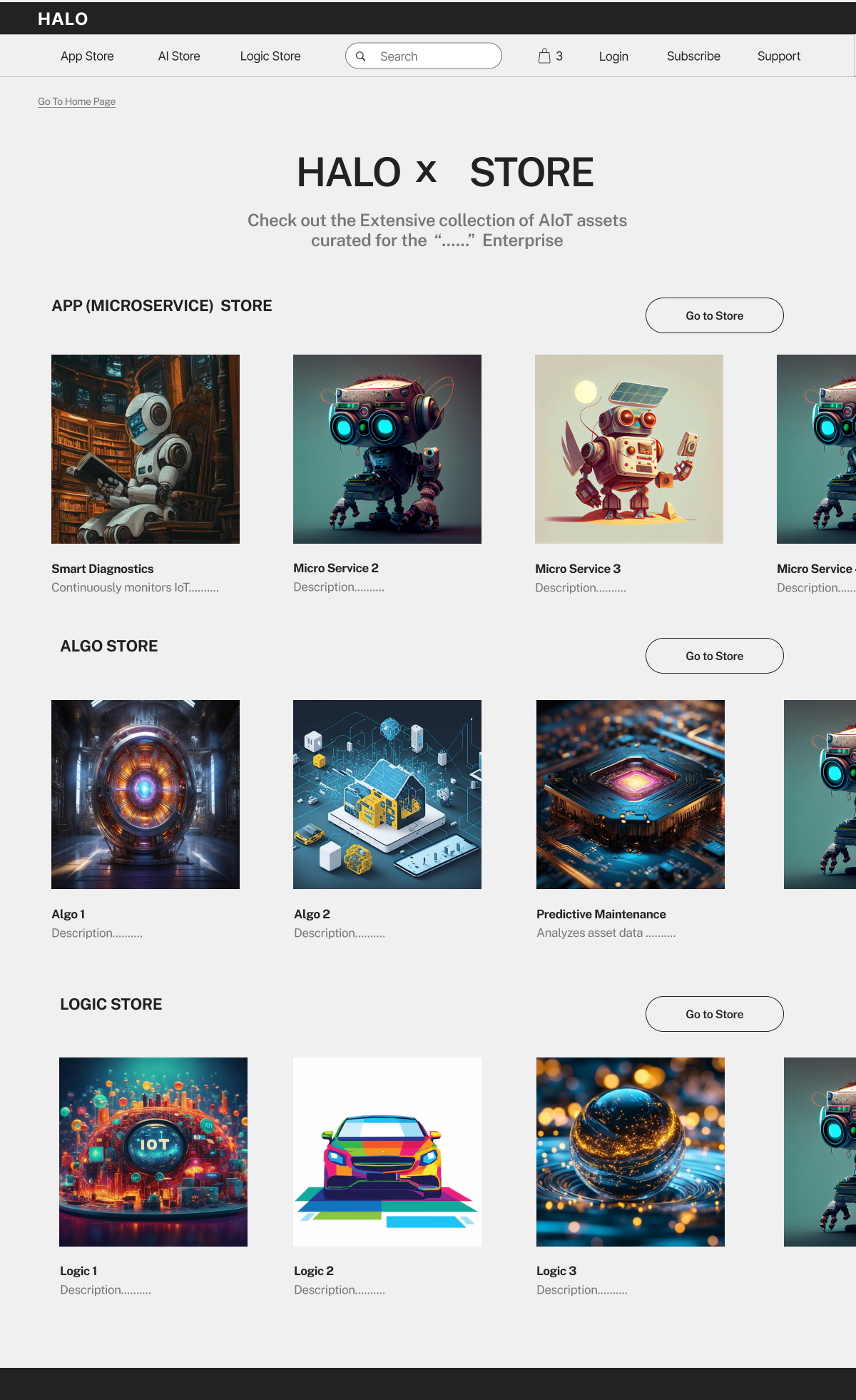
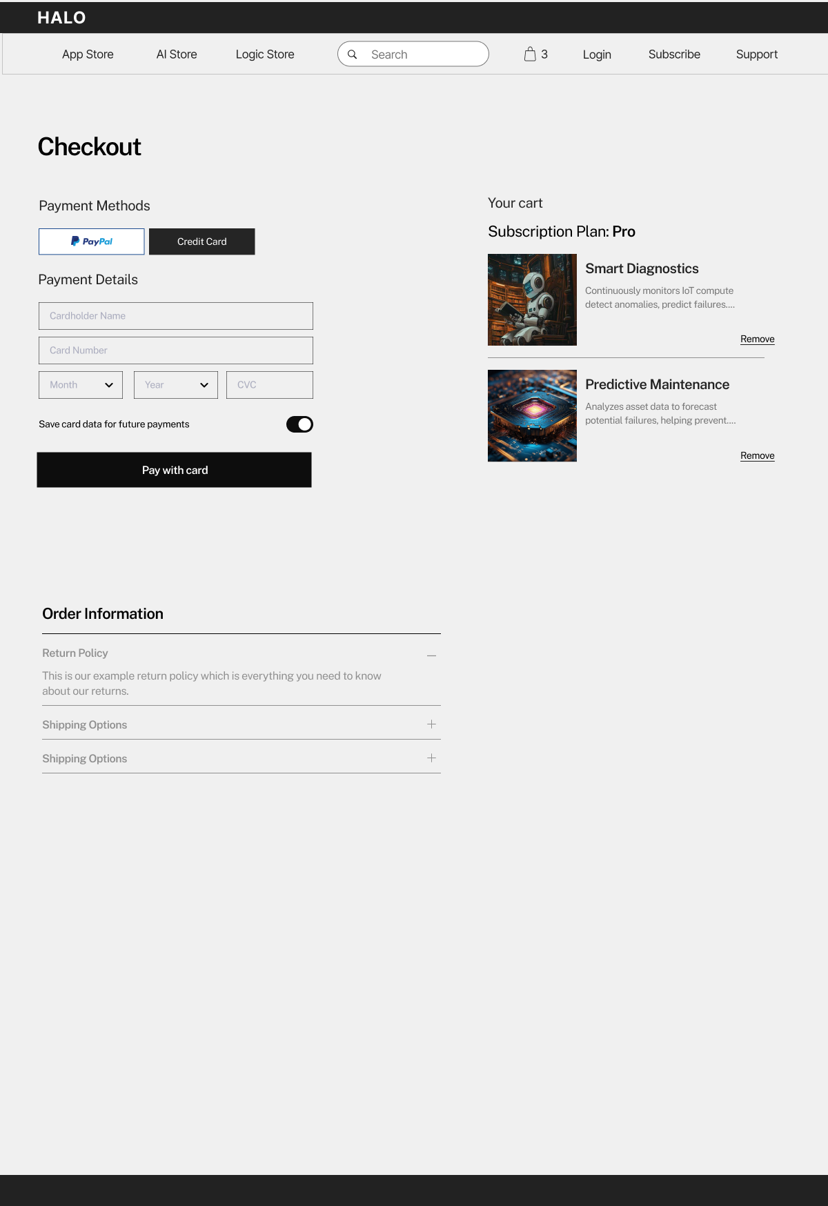
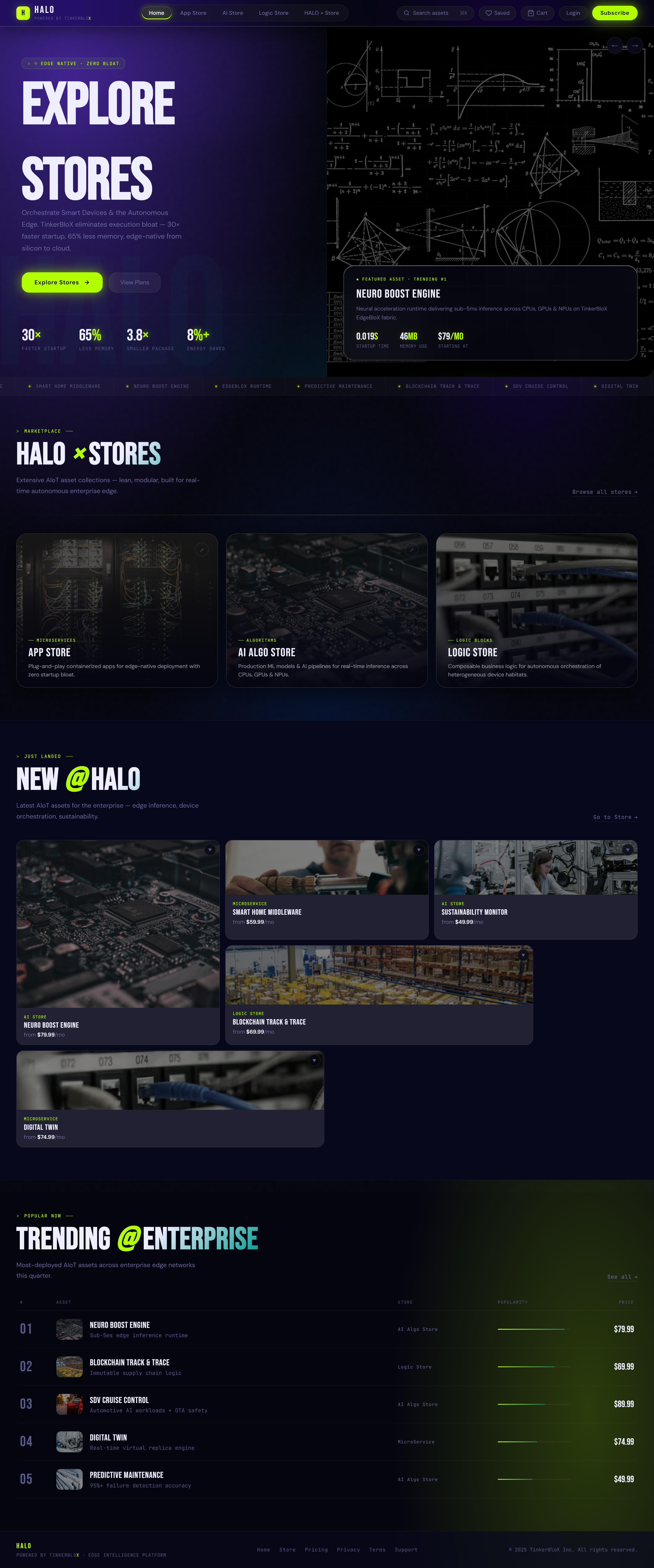
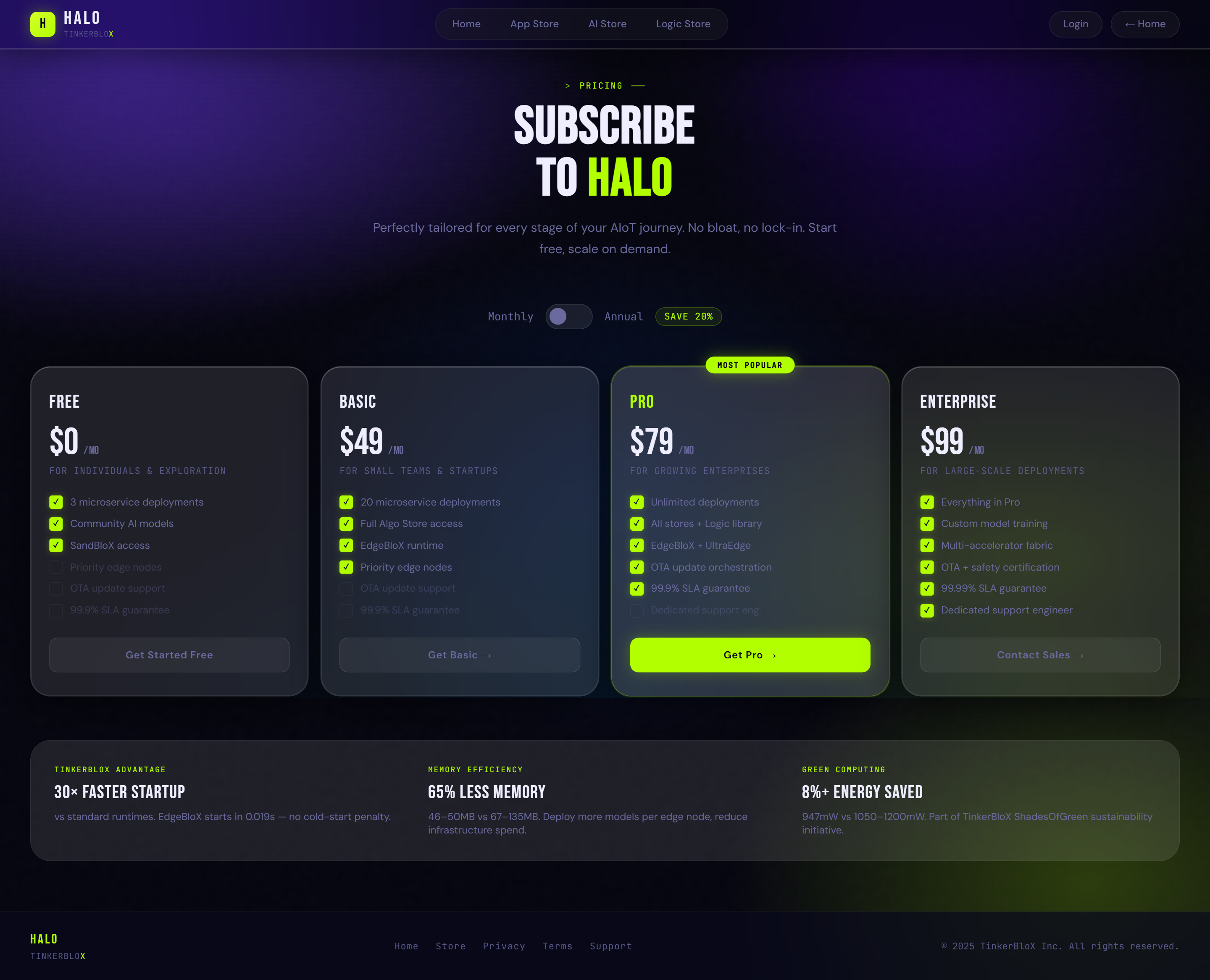
case 03 · ui/ux design · edge iot marketplace · may 2026
HALO × TinkerBloX
A fully interactive Edge AI IoT marketplace for TinkerBloX — designed, prototyped and shipped in a single day. Eight screens. Real interactions. Made for an investor pitch, handed to the dev team. I had one day and I made it count.
ProblemTinkerBloX needed an investor-grade AIoT marketplace prototype before a pitch meeting — with one day to deliver.
What I didDesigned 8 fully interactive screens from scratch — design system, IA, wireframes, UX audit, live prototype.
The twistDesigned everything in Figma first, then directed Claude Code with exact specifications — no vague prompts, no guessing.
ResultWent to the investor meeting. Then handed to the dev team as the build reference. Delivered in 1 day.
⚡ short on time? try Highlights in the sidebar — key moments only.
1
day end-to-end
8
screens designed
6
micro-interactions
↑ the live prototype — click to explore
"Make it look real enough to raise money."
★ the call
TinkerBloX builds Edge AI runtime software — the kind that runs directly on hardware, no cloud needed. They were building a marketplace called HALO and needed a fully interactive demo for an investor meeting. One day. Real screens. Real interactions. Nothing fake.
Who they are
TinkerBloX
A startup building Edge AI runtime software — AI that runs directly on devices like sensors, cameras, and industrial machines. No internet, no cloud, no latency.
The product
HALO Marketplace
An Edge AI IoT marketplace where companies can browse, buy, and deploy AI microservices, algorithm modules, and logic blocks directly to their edge hardware.
What I had to do
Design + Build
Design the full UX from scratch, build a live interactive prototype, deliver before their investor meeting — all in one day. Every screen clickable. Nothing fake.
They called. I took notes.
Edge AI is a big deal for industry. Think factories monitoring equipment in real-time, smart cities managing traffic and energy, automotive systems running diagnostics on the vehicle itself. All of that intelligence needs to happen on the device — too latency-sensitive for the cloud, too critical for downtime. TinkerBloX is building the software layer that makes that possible.
HALO was their marketplace vision — a place where industrial companies could browse pre-built AI modules, buy what they need, and deploy straight to their hardware. Like an app store, but for AI. But for IoT. But not in the cloud.
They had investors coming in who needed to believe this was real before it was built. So they needed a UX designer who understood both the product and the business moment — and could move fast.
They explained exactly what the platform would sell:
01
AI Microservices
Plug-in AI modules for specific edge tasks — diagnostics, inference, anomaly detection.
02
Algorithm Modules
Pre-trained neural runtimes optimised for constrained hardware with sub-5ms inference.
03
Logic Blocks
Composable control flow components — deploy, chain, and orchestrate across devices.
"ok so it's like an app store. but for AI. but for hardware. but not in the cloud. got it."
taking notes
★ the challenge
No discovery phase. No user research sprint. The brief was simple: build something real enough that investors feel confident writing a cheque. That meant designing for two completely different people at the same time.
Two audiences. One product.
① The constraint
Investors can spot a wireframe from across the room. A static mockup signals the team hasn't shipped yet. A prototype IS the pitch. It needed to feel real — not look like a prototype.
② What I did
Designed 9 fully interactive screens in one day. Real copy. Real pricing. Real empty states. Real cart logic. Every click leads somewhere — no dead ends.
③ The result
A live web prototype investors could demo on their own device — something that felt like it already existed, delivered hours before the meeting.
one day deadline
★ who I designed for
Two very different people sitting across the same table — one building the product, one buying it. Getting it right for both meant understanding what "this works" actually means to each of them.
Two audiences. One product. No pressure.
🏢
Audience 01
TinkerBloX
The Platform Owner · Needs It Fundable
"It has to hold its own in an investor room."
What they needed ↓
✓Looks credible on a projector in a pitch room
✓Clear categories + subscription tiers without explanation
✓A co-investor can click through it without a tour guide
✓Feels like a product that already exists, not one that might
🏭
Audience 02
Industrial Buyers
Factories · Smart Cities · Automotive · Energy
"We need to trust this before we put it in infrastructure."
✓Subscription plans that map to enterprise budget cycles
✓Platform that signals reliability, not experiment
✓Browse and filter by what they actually need — no guessing
TinkerBloX wants to impress
⟺
Enterprise buyers want to trust
two people, one product
TinkerBloX needed something investors believed in. Their customers needed something operations teams trusted.
Every screen had to speak to both. If it only worked for one, it went back to the drawing board.
✦ The design had to work on two levels at once: credible enough for investors to fund, and trustworthy enough for enterprise buyers to actually use. Getting that balance right wasn't just a visual challenge — it was a business challenge. TinkerBloX's growth depended on it. ✦
the process ·
Research. System. Architecture.
★
★ research & ux thinking
Before opening Figma I needed to understand the space — how B2B technical marketplaces work, what industrial buyers actually need to feel confident, and what information architecture makes sense for a product catalogue this complex.
Figure out the problem before designing the solution.
The question wasn't "what looks good" — it was "how do enterprise buyers actually decide?"
I audited AWS Marketplace, Azure Marketplace, Stripe's product pages, and IoT platform dashboards. The patterns were consistent: lead with the outcome, follow with the specs, make pricing impossible to miss.
Then I mapped the core user flows — discovery → evaluation → purchase. That gave me the IA skeleton before a single screen was designed. The IA diagram lives in the next section.
①
COMPETITIVE AUDIT
Looked at B2B technical marketplaces and how they structure product discovery. The consistent pattern: category-first browsing, specs visible without clicking through, and subscription tiers that map to organisational size — not individual usage.
What I looked at
AWS Marketplace
Azure Marketplace
HALO decision
Product discovery
Search-first, keyword-driven
Category filter + keyword
Browse by store type first — buyers know which category they need before they search
Buyer type
Developers + DevOps
Enterprise IT teams
Industrial operations + procurement — not developers. Specs and trust signals matter more than API docs
Pricing visibility
Metered or "contact us"
Listed + negotiated for enterprise
Clear subscription tiers shown upfront — enterprise buyers won't evaluate what they can't price
Outcome description first, specs below, Add to Cart + Subscribe split CTA — two different buyer intents on one page
②
DEFINING THE KEY FLOWS
Three critical journeys: discovering a product → evaluating it in detail → purchasing with the right plan. Each flow had to feel frictionless — enterprise buyers aren't patient with confusing navigation, especially when they're evaluating multiple vendors simultaneously.
③
DESIGNING FOR TRUST, NOT JUST AESTHETICS
Enterprise buyers need to trust a platform before they'll even consider deploying it in critical infrastructure. That shaped everything — the spec tables, the clear subscription tiers, the product categories that mirror how IoT professionals think about their stack.
deep in research
AWS Marketplace ✓
Azure Marketplace ✓
Stripe Dashboard ✓
Linear ✓
IoT dashboards ✓
The brief mentioned teal. I immediately felt that was off — teal reads as "safe startup circa 2022." HALO needed to feel precise, fast, and edge-native. I went with electric lime (#B2FF00) on near-black. One accent colour doing all the heavy lifting.
★ design system
I locked the visual language before touching a single screen layout. Color. Typefaces. Component rules. All settled first — so every screen that followed was a decision applied, not a decision made.
Locked first. Applied consistently.
Color System — shown in product context
halo marketplace · v2.4Edge AI
Electric Lime
#B2FF00
Every accent. Buttons, badges, prices, hover glows. One color carrying the entire brand signal.
Void
#08081c
The ground. Everything else sits on top — glass surfaces float against it.
Glass
12–20% white
All card surfaces. Transparency creates depth — you see void beneath, layer above.
Ghost White
#eeeeff
Body text. Blue tint keeps it readable on void without being harsh.
SmartHome AI
Edge Vision Kit
v2.4.1 · edge-native · 0.019s
Add to Cart
↑ How the colors actually look in-product. Dark ground + lime accent = clean technical hierarchy.
Type System — three registers
Bebas Neue
Impact · Hero · Uppercase
HALO STORES
→ hero text, nav labels, section headers
DM Sans
Body · UI copy · Readable
Deploy AI microservices directly to your edge devices. No cloud. No latency.
→ product cards, descriptions, CTAs
JetBrains Mono
Technical · Data · Specs
> runtime: 0.019s · edge-native · v2.4.1
→ specs, badges, price tags, version numbers
three fonts, one voice
Three typefaces doing three completely different jobs. Bebas for drama. DM Sans for clarity. JetBrains Mono for credibility.
The mono font was the most important call. Every developer who sees version numbers in JetBrains Mono immediately trusts the product a little more. It's a visual handshake.
★ ia & flows
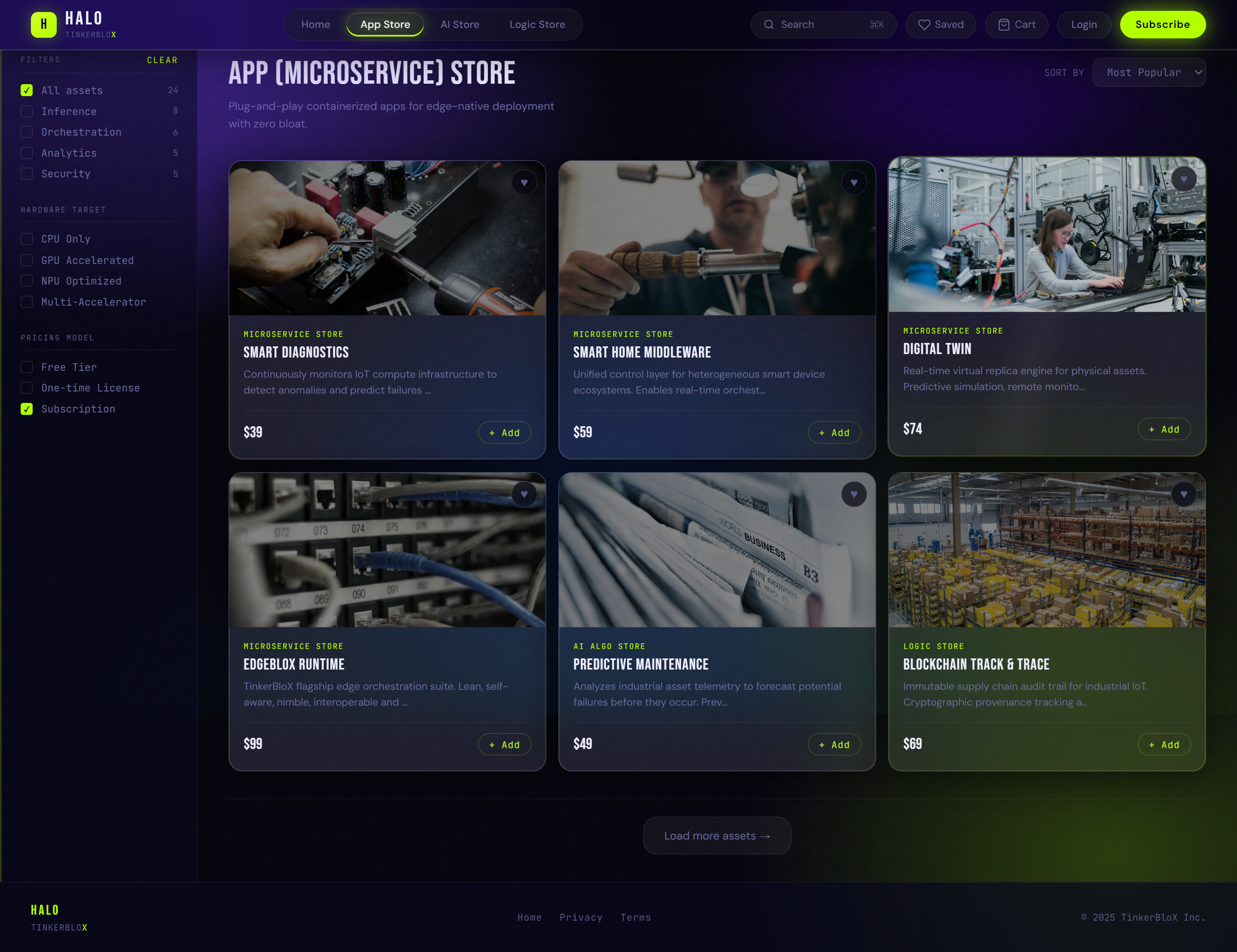
8 screens. 3 user flows. 0 dead ends. The architecture was mapped before anything was designed — because if the structure isn't right, no amount of visual polish fixes it.
Structure first. Then pixels.
The 8-screen scope was settled in the first hour. Every screen maps to a real action a developer or investor would take — nothing added for padding.
Information Architecture
User Flows
Primary Flow · Browse & Buy
Secondary Flow · Subscribe
Utility Flow · Save & Return
the build ·
Figma. Direction. Audit.
★
★ figma → claude
I designed the full system in Figma first. Then I directed Claude Code to build it — not as a code generator, but as a build partner I was briefing with precision. The bottleneck was never the code. It was knowing exactly what I wanted.
I designed it. Then I directed it.
After locking the design system in Figma, I built wireframes and mockups of all 8 screens. Not pixel-perfect — enough to brief a developer precisely. Clear layout, component hierarchy, interaction intent, spacing rationale.
Then I directed Claude Code using those wireframes as reference — not by uploading files, but by translating my design decisions into exact verbal specifications. "The hero section needs kinetic text animation. Words slide in with a blur filter and 8° skew on a staggered delay. Here's the CSS approach I want." That level of specificity.
To be clear: every layout decision, every spacing choice, every interaction behaviour, every component state — I defined all of it before Claude wrote a single line. The wireframes below show the thinking. Claude executed it. The output is only as good as the brief, and the brief was mine.
In 2026, this is what design work looks like. The skill isn't knowing how to code. The skill is knowing so precisely what you want that the AI never has to guess. Vague direction produces vague output.
briefing claude
ia before figma
Eight screens doesn't sound like much until you realise each one needs at least three states: default, loading, success. And every single click has to go somewhere.
I mapped the information architecture on paper before opening Figma. Not because the wireframes were precious — because the decisions were.
one day. eight screens.
No wireframe-to-feedback loop. No revision rounds. The wireframes were the handoff — straight into the build.
Every call I made became a real screen. Which means every decision had to be right the first time.
The wireframes — what I handed off to Claude
Store Overview
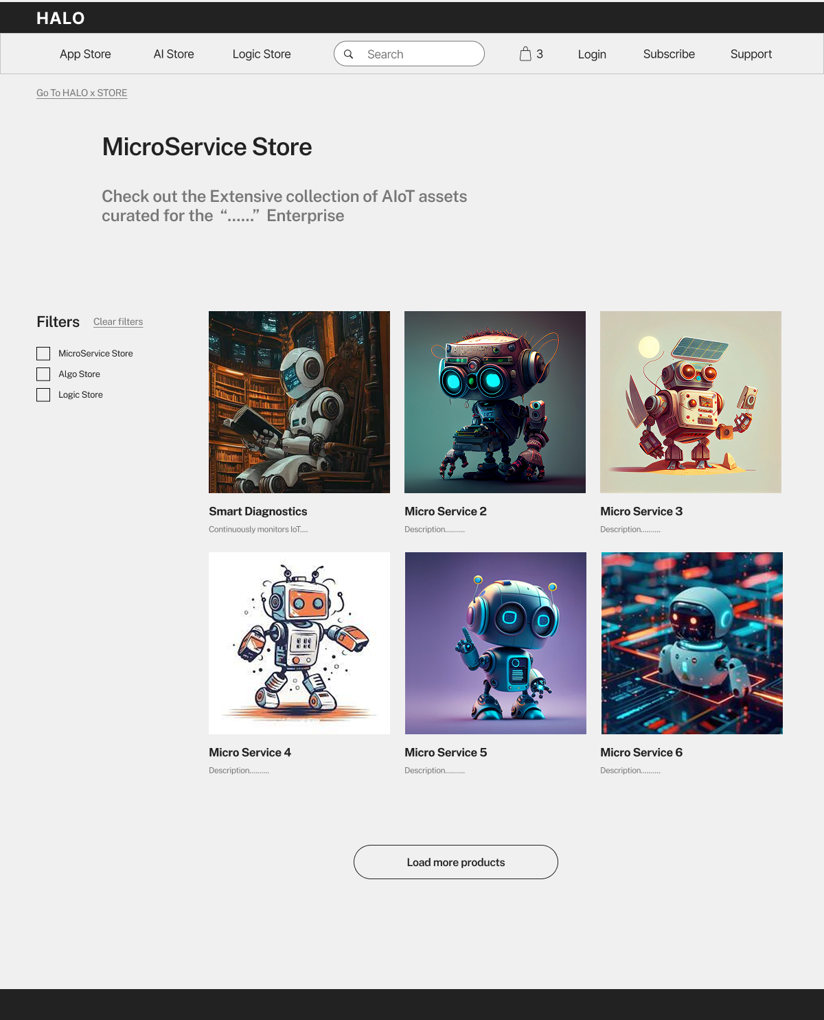
3 store types were TinkerBloX's requirement. My decision: equal-weight card layout so buyers immediately identify which category they need — no dropdowns to dig through.
MicroService Store
Left-rail filters borrowed from the AWS/Azure audit. Industrial buyers filter before they browse — they already know the category, they need to narrow by spec.
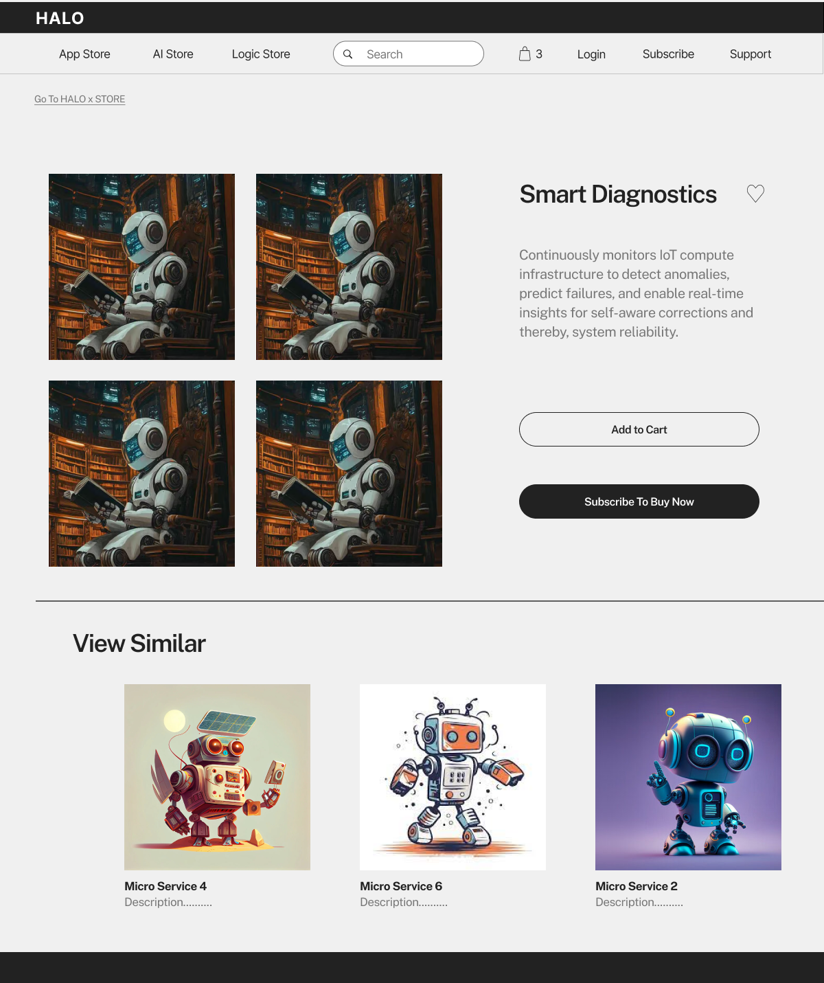
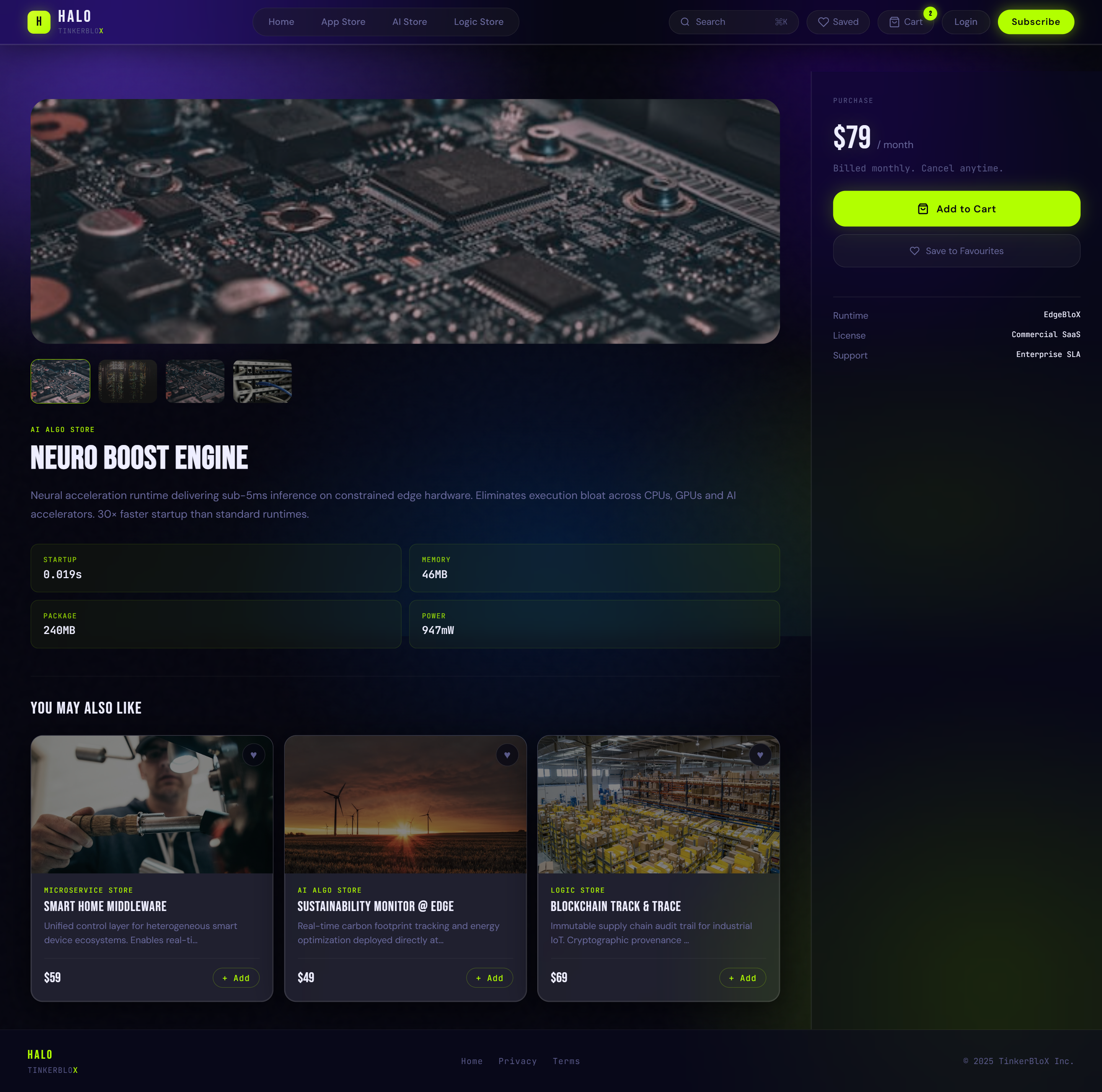
Product Detail
Image gallery left, description + CTAs right. Two intentional CTAs: "Add to Cart" for evaluation, "Subscribe to Buy Now" for committed buyers. Two different intents, one page.
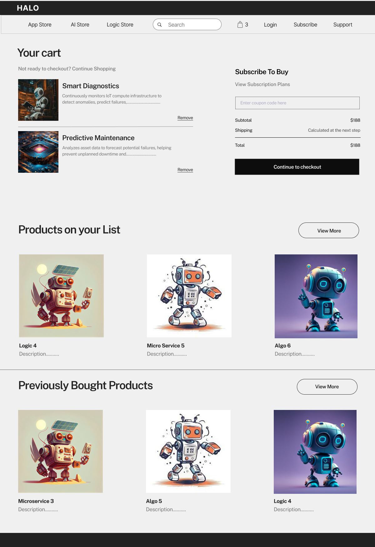
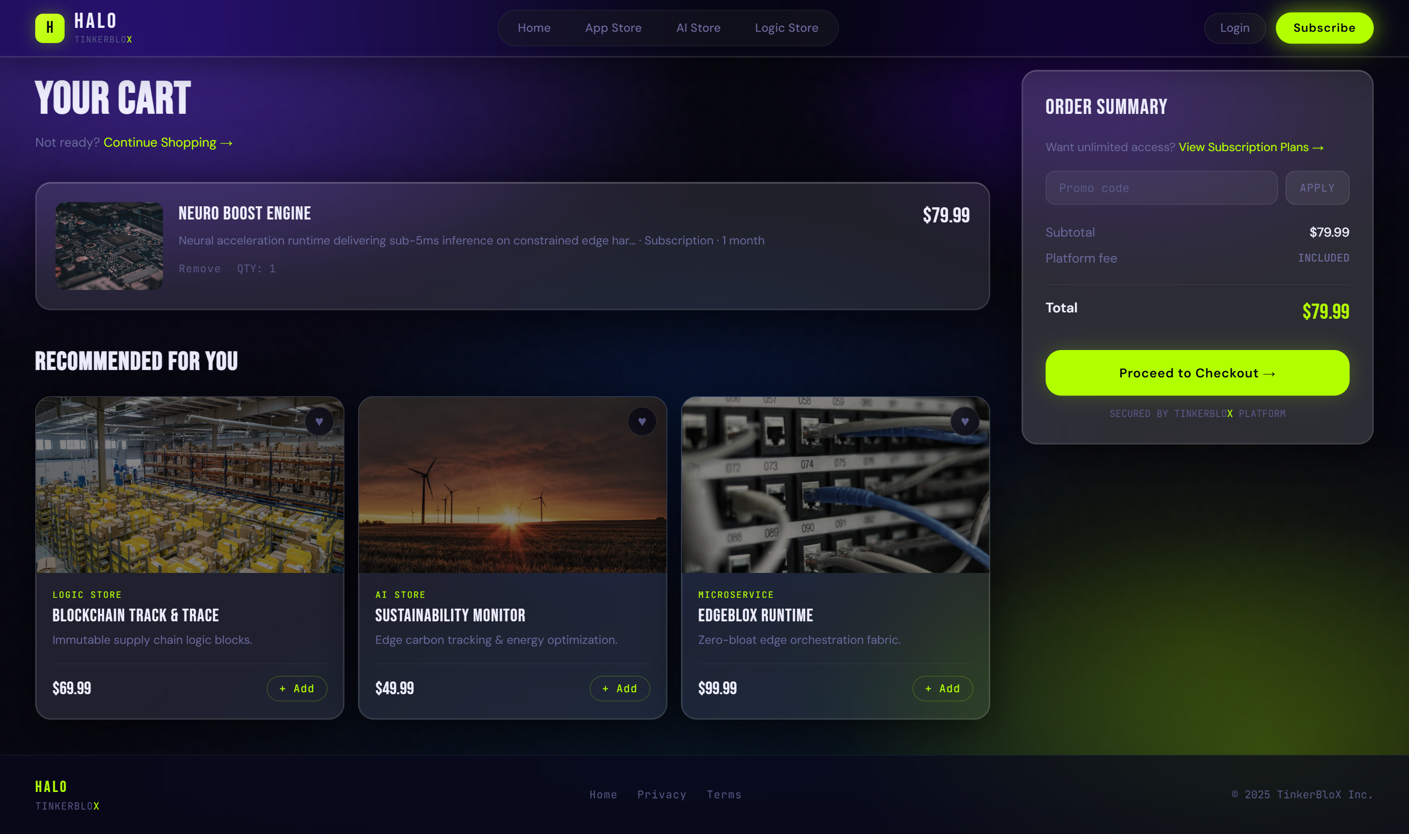
Cart
"Products on your List" + "Previously Bought" below the cart — enterprise buyers re-order and upsell across teams. This wasn't in the brief; I added it for repeat purchase behaviour.
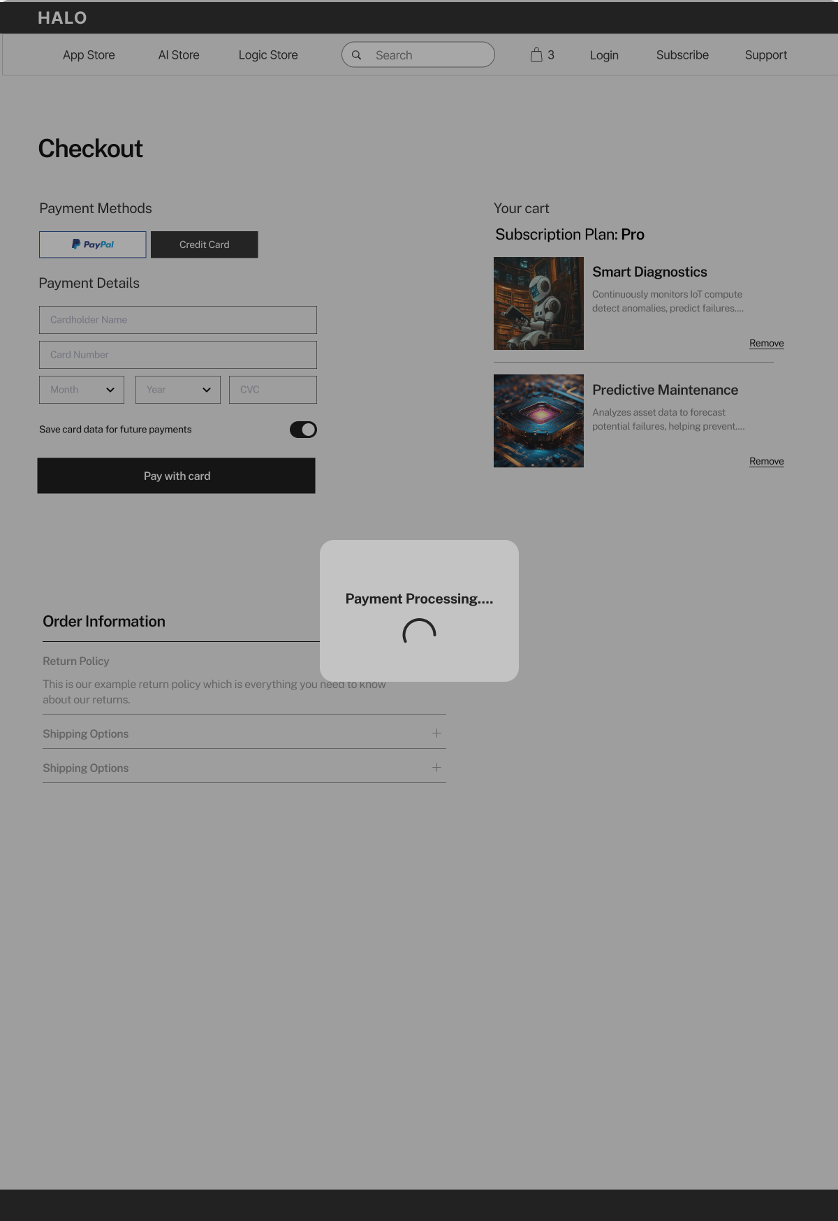
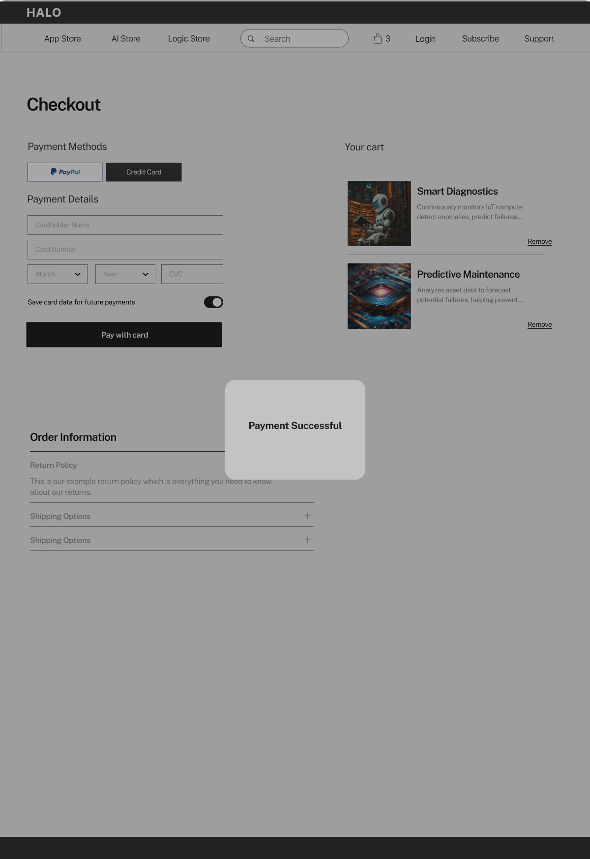
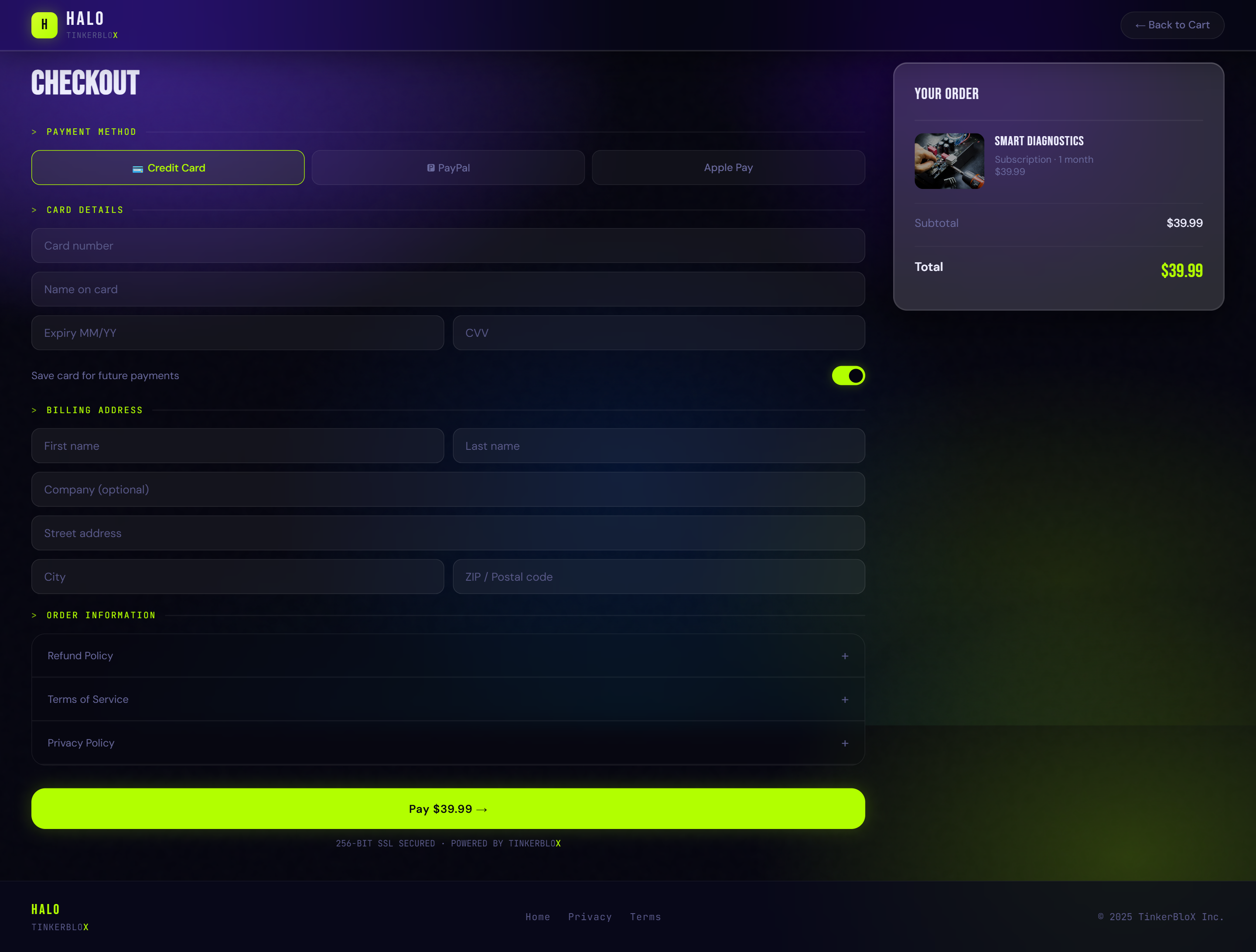
Checkout · Default
PayPal / Credit Card split. Enterprise teams often have corporate card mandates — both paths need to be first-class.
Checkout · Loading
Every state designed — not just the happy path. A blank screen during payment processing makes enterprise buyers anxious.
Checkout · Success
Unambiguous confirmation. In B2B, a failed or unclear payment triggers an ops ticket. The success state has to be loud and clear.
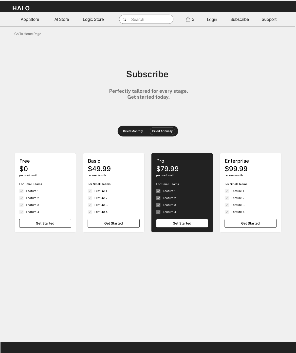
Subscribe · Pricing
4 tiers including Free — low barrier to adoption for a new marketplace. Monthly/annual toggle baked in from the start because enterprise budgets run on annual cycles. Enterprise tier anchors perception of the whole pricing page.
What came next
These wireframes were the brief. Everything above is what I asked Claude to build — with exact specifications for spacing, animation, interaction behaviour, and visual hierarchy on every single screen.
How the direction actually sounded
Me →
"The nav bar — fixed, not sticky. Background should be a very slight glass blur, maybe 8px blur with 8% white opacity. The HALO wordmark in Bebas Neue, 18px. Cart icon on the right with a live badge that updates on addToCart."
Me →
"The product cards need 3D tilt on hover. Max 12 degrees per axis. The lime accent border should glow slightly. I want the tilt to feel physical — like holding a card — not like a CSS trick."
Claude →
[built it]
★ ux audit
After the first build pass, I did a full UX audit. Not just visual QA — actual design critique. Hierarchy, spacing, state management, information density. Things only a designer would catch.
Built it. Then fixed it.
I reviewed every screen the way a senior designer would review a junior designer's work — with a specific eye on what the user actually sees first, whether the hierarchy is working, and whether anything feels off.
①
INFORMATION HIERARCHY ON PRODUCT CARDS
The first build put the price and the title at the same visual weight. Fixed: title bigger, category tag in mono above it, price in lime accent. The eye now reads: what is this → what category → how much. In that order.
②
CHECKOUT GLASSMORPHISM DEPTH
The initial checkout panel wasn't glassy enough — it looked flat. I pushed the blur to 20px, added a white ice-edge highlight on the top border, and added an entry sweep animation. The premium feel didn't land until those three things were right together.
③
EMPTY STATE HANDLING
The cart and saved assets pages needed proper empty states — not blank screens. Added illustrated lime-accent empty states with a CTA. Empty screens in an investor demo signal "the team hasn't thought this through." Small detail. Big signal.
④
SEARCH OVERLAY FEEL
The search overlay needed a backdrop blur and a smooth slide-down entrance. The first version just appeared — no animation. I corrected it: blur the background, slide from -20px to 0 with a 200ms ease-out. Now it feels like a real ⌘K command palette.
UX audit mode
This is where UX knowledge actually matters. Anyone can tell Claude to "build a product card." A designer tells it exactly what hierarchy the eye should follow, what the hover state should communicate, and why the spacing is 16px not 12px.
The audit is where the design skill shows up in an AI-directed workflow.
the result ·
Eight screens. Shipped.
★
★ what shipped
Eight screens. Every one fully interactive. Real copy, real pricing, real empty states. Delivered before the investor meeting.
8 screens. Every one clickable.
01 · Home
02 · Product Detail
03 · Store
04 · Cart
05 · Subscription
06 · Checkout
07 · Login
08 · Saved
↑ Click any screen to open the live prototype
wireframe → final
From sketch to shipped.
The wireframes defined every decision. The final prototype executed them. Here's what that translation looked like on three key screens.
Store — category browsingwireframe → final
Wireframe
Final prototype
Decision: Wireframe established card-based store navigation — three equal-weight store types so buyers self-select immediately. Final added glassmorphism cards, lime accent borders, and 3D tilt. The structure stayed identical; the visual language made it feel like a real product.
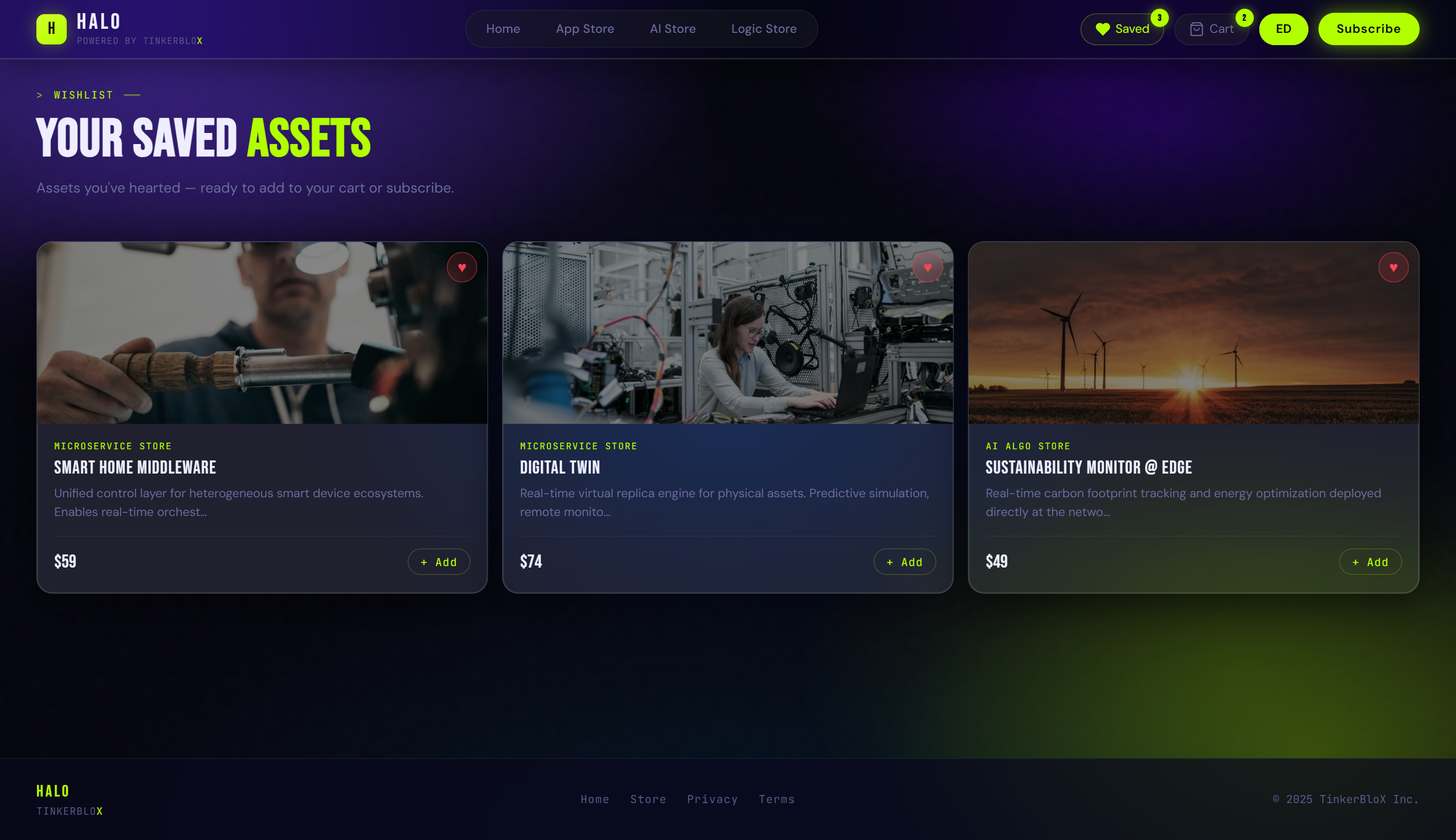
Cart — live purchase flowwireframe → final
Wireframe
Final prototype
Decision: The wireframe already had the "Subscribe to Buy" panel on the right and coupon code field — both business requirements. The final added the dark glassmorphism cart panel, live badge updates on Add to Cart, and real product images. The cart badge updating live is the single moment investors say "wait, is this actually built?"
Subscription — pricing tierswireframe → final
Wireframe
Final prototype
Decision: Four tiers including Free — low barrier to entry for a new marketplace. Monthly/annual billing toggle was in the wireframe from the start because enterprise teams plan on annual budgets; the toggle makes that switching moment tangible. The final used dark-on-light card contrast to signal which tier is recommended without forcing it.
★ interactions & feature highlights
The brief said "interactive demo." I decided it should also feel delightful. Six interactions I researched, designed, and specifically directed — the difference between a wireframe and something investors believe in.
Good enough wasn't good enough.
None of the kinetic hero text, 3D tilt, or ⌘K search were in the brief. Those were my additions — because I knew what the product needed to feel trustworthy to enterprise buyers and exciting to investors at the same time. The interactions are the argument.
↑ full interaction walkthroughall 6 highlights · click to play
01 · Kinetic Hero Text
Words animate in on load with blur + skew. Sets the energy of the entire homepage in the first second. Investors subconsciously classify the product as premium before they read a word.
02 · 3D Tilt on Cards
Product cards tilt with the cursor in 3D — up to 12° per axis. Makes every card feel physical and tactile. Enterprise buyers pause on it. Developers hover it twice because it's just satisfying.
03 · Live Cart Updates
Add to Cart updates the badge, recalculates totals, flashes the button — all live, no reload. This single interaction is what makes investors stop and say "wait, is this actually built?"
04 · ⌘K Search Overlay
Global search opens with a keyboard shortcut and filters live as you type. Immediately signals to buyers that this product was built by people who understand how they work.
05 · Billing Toggle
Annual/monthly switch updates all plan prices live. Makes the business model tangible in a room — one of the most convincing signals for investors and procurement leads.
06 · Glassmorphism Checkout
Frosted glass checkout panel — 20px blur, white ice-edge highlight, sweep entry animation. The moment the premium design language lands hardest. It earns the price tag.
"more glow. yes. MORE glow. now bring back 10% of it." — me, directing the glassmorphism checkout at 11pm
the impact ·
Not a demo. A blueprint.
★
★ impact
This wasn't a side project or a portfolio exercise. It was a real brief with a real deadline — and it went to a real investor meeting. Here's what it actually delivered.
One day. Real outcomes.
01
Went to the investor meeting
The prototype was the centrepiece of TinkerBloX's investor pitch. It made an unbuilt product feel real — clickable, priced, interactive. That's the hardest thing a designer can do: make someone believe in something that doesn't exist yet.
02
Handed off to dev team
After the pitch, the dev team received the prototype as their build reference. Not a mood board. Not a spec doc. A live, functioning prototype they could click through — every screen, every interaction, every state.
03
Delivered in 1 day
8 screens. 6 live interactions. A full design system. A UX audit. All done in a single working day. Not because corners were cut — because every decision was intentional and nothing unnecessary got made.
04
Looked nothing like a demo
Real copy. Real pricing. Real empty states. Real interactions. Not placeholder text and grey boxes — a product that looked and felt like it had been in development for months. Good design thinking makes funding feel less like a gamble.
"The designer is part of the pitch too." When a product looks polished and thought-through, investors aren't just evaluating the technology — they're evaluating whether this team can execute. Strong UX design sends a signal that goes beyond the screen.
★ reflections
Honestly? This one went really well. Here's what I took away from it — and what happened after the pitch.
It went to investors first. Then to the dev team.
01
IT WENT TO AN INVESTOR MEETING
The whole point of this prototype was the pitch. TinkerBloX needed something they could walk into an investor meeting with and say "here's the product." That's what I built — something that could hold up on a projector, get clicked through by people who'd never seen it, and make the business feel real. It went to the meeting. That was the job.
02
THEN THE DEV TEAM PICKED IT UP
After the pitch, TinkerBloX handed the prototype off to their development team as the reference for the real product build. Honestly, that's the best outcome a UX prototype can have — it didn't stay a demo. It became the blueprint. I think that's pretty lovely.
03
TIGHT CONSTRAINTS = BETTER DECISIONS
One day means you simply can't waste time on decisions that don't matter. I spent time where it genuinely had weight — the information hierarchy, how the product categories felt to navigate, what the cart experience communicated about pricing. Everything else got cut. That discipline is something I want to carry forward even when I have more time.
04
HONESTLY, I'M REALLY HAPPY WITH THIS ONE
One day, eight screens, six real interactions, a full UX audit — and something that went to an actual investor meeting and then got handed to developers. I look at what came out and I genuinely can't think of what I'd change. That's a rare feeling and it's worth saying out loud.
05
WHAT I'D DO WITH MORE TIME
With more breathing room I would have gone deeper — "Previously Bought" and "Trending at your Enterprise" personalisation, smarter recommendations between the three store types, maybe a compare feature for enterprise buyers evaluating multiple modules. Not because those were asked for, but because I was already thinking about them. The brief said demo. I was already designing the real product in my head. That's what I liked most about this one — I was still being creative, still going further than what was asked, even on a one-day clock.
★
"Investor meeting first. Dev team second. One day, eight screens. I'd do it exactly the same way."
edge native ✦
TinkerBloX trusted me with the thing that mattered most — the first impression. That means a lot.
I design interfaces, write copy, dream in animation, and occasionally vibe-code. I grew up in Bangalore — the kind of kid who paused Disney movies to study why a scene felt right. That curiosity became a Master's in Human-Centered Design from Pace University, and I'm still doing exactly that: figuring out why things feel the way they do, then making them feel better.
the dream
My dream job is at Disney. I'm being completely earnest. Growing up with Pixar and Disney taught me more about emotion, color, and storytelling than any textbook — the warmth of a Ratatouille frame, the way a single sequence makes you feel something before you understand why. That's the eye I bring to every screen I design. I notice color everywhere: on book covers, in the light at 5pm, in the spacing of a street sign. Design inspiration is just paying attention — and I can't stop.
"UX designing is the best IT job one can ever do — designing with concern for the business and the people. It is totally me."
when i'm not designing
I'm a dancer. I make digital art and I'm learning animation (slowly, joyfully). I read fiction obsessively — especially anything with a cover so beautiful I'd frame it. I watch romcoms unironically and more animation movies than is probably age-appropriate. I'm the kind of person who takes a while to open up — shy at first, then suddenly very much not shy. I care deeply about the people around me, which is probably why UX felt inevitable: it's the one job where caring about people is literally the job description.
the bigger picture
I want to open an organization to help people with disabilities — design access is something I feel strongly about. I also want to write a book someday (holding onto that one). I love teaching, love kids, and if you took design away I'd end up at a bookstore, a publishing house, or in front of a classroom. I'm a big dreamer. That's not a disclaimer — it's a feature.
★ currently open to roles · brooklyn, remote, or relocating
Let's make something great.
UX design · UX research · CX · product design · UX writing · full-time or contract
Tools I actually open every day. Not "things I've heard of" or "things that look good on a portfolio." These are the ones I'd miss.
01 · design
Figma
Where most of the thinking happens. I prototype, write, comment, and argue with myself in here.
02 · build
Cursor
For when the design needs to go past Figma. I vibe-code production sites here with Claude.
03 · think
Claude
My pair-thinker. I draft copy, sanity-check IA, pair on code. Currently writing this with it.
04 · prototype
Framer
For when a Figma proto isn't enough and a real codebase is too much. Lives in the middle.
05 · scaffold
v0
For getting from sketch to working component fast. Useful when the brief is "make me see it."
06 · keep
Notion
Project notes, research dumps, meeting recaps. Less elegant than I'd like, but it works.
07 · test
Maze
For unmoderated tests when I need numbers, not vibes. I still prefer interviews when I can get them.
08 · write
A pen
Muji 0.5 black, ideally. I think on paper before I think on a screen. Always have. Probably always will.
close ✕
I'm open to roles, briefs, and cold emails that aren't actually cold. If you have a product that matters and need a designer who will genuinely care about it — about the users — I would love to hear from you.
— with so much love (and cold brew) from brooklyn ♡
close ✕
★ now playing — irl
—
currently vibe-coding
a portfolio. this one. the recursion is, frankly, getting to me.
projectsupritha.design v.next
stackclaude · cursor · panic
cold brew#4 (don't tell anyone)
etasoon ™
★ how the sausage is made
my "process" (loose term)
It's a loop, not a line. Anyone who tells you design is linear is lying or selling you a workshop. Mine looks something like this on a good day. (On a bad day it's just step 5 again.)
01
read
Read everything.
The brief. The Slack threads. The complaints. The PRD nobody updated. Every dropdown label.
→
02
write
Write before drawing.
Microcopy first. If I can't say what the screen is for in plain english, the screen doesn't exist yet.
→
03
sketch
Sketch ugly.
Pen on whatever paper. Boxes and arrows. The faster it's ugly, the faster it stops being precious.
→
04
ship
Ship something.
Anything. Even incomplete-looking. Real users in five minutes beats a Figma file in six weeks.
→
05
fix
Fix it.
Read the data. Read the complaints. Then go back to step 1, because design is a loop, not a finish line.
↪ loop forever · until somebody pries it from your hands
★ three things i believe
three things I keep coming back to
№ 01
I steal colors from book covers.
I read a lot. Romance, fantasy, the literary stuff. The covers stacked next to my bed are my real color inspiration — not Figma Community.
Book covers do the same job we do: make someone feel something in three seconds. So when I need a palette, I look at my shelf first. This portfolio started there too.
№ 02
I don't follow the rules. The work is still good.
I didn't go to design school. I don't memorize frameworks. I sometimes pick a font because it just looks right.
What I have instead: taste, a lot of reading, and a willingness to throw out anything that isn't working. It works. People click.
№ 03
I think about users like they're my people.
I put people first in real life. That doesn't switch off when I open Figma. I'm not thinking about "the user" as a spreadsheet — I'm thinking about a real person trying to get something done on a Tuesday.
So empathy isn't a tool I add on top. It's just how I think.
that's how I think about it ♡ more on the wall
← back to the room
close ✕
★ the photobooth
Take a polaroid.
Click the button, smile (or don't), and you'll get a souvenir polaroid from this room. We'll need camera access — nothing's stored anywhere.
★ smile if you want to
Ready?
★ a souvenir
Here you go.
your souvenir from supritha's room — download to keep ↓
Your browser or device blocked the camera. To fix: open your browser Settings → Site permissions → Camera, and allow this site. Then tap "try again" below.